
British Airways website (actually: booking system) not only still looks like most pages looked ten or even fifteen years ago. Seems that latest look change they had before Zuckeberg invented Facebook. You can only dream about optimized, mobile-friendly design. Anyway, that is not all. Their website is also full of stupid fuckups and nasty bugs.
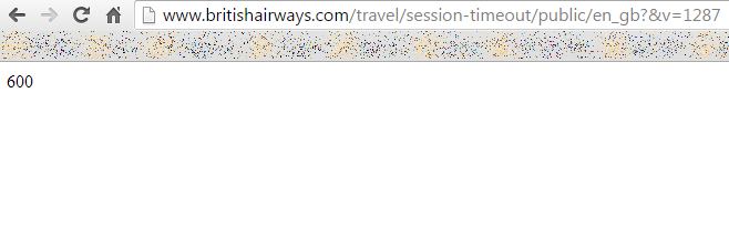
Here you have just a few examples. Things, you would never found on serious websites, here are everyday user experience. For example -- empty pages with error code and damn explanation, WTF:
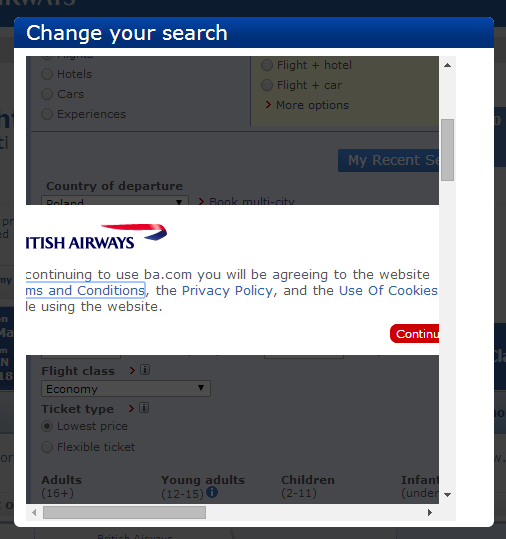
Or popups, that -- instead of expected content -- contains some shitty messages, misaligned buttons and generally enforces you to refresh page or restart booking process from scratch, because you can't do anything else:
Now, the good question, that comes to my mind is -- would you let your money, time, trust and travel schedule to the company, which offers you such website?